I finally came to terms with admitting that if I put off showing you guys the rooms in our house, I won’t blog in, like, a whole year. I blame all of those Pinterest-perfect images of immaculately curated, HGTV-worthy homes floating around blogosphere. I don’t know about you, but if my house were to ever look like that, it would probably self-combust under the pressure to maintain that appearance.
Much to my embarrassment, there are tons of moving boxes shoved into empty closets, because when you want to fake having it all together there’s nothing like sweeping things under the rug, amiright? I’m not sure if I’m going to do a home tour (unless you REALLY want to see it) but I need to be honest here: most of our effort (see also: money I’d rather put towards new furniture) has gone towards the exterior of the house. I promise to follow through with the curb appeal post, but we’ve experienced monsoons here in Florida and it’s put a damper on my photography attempts.
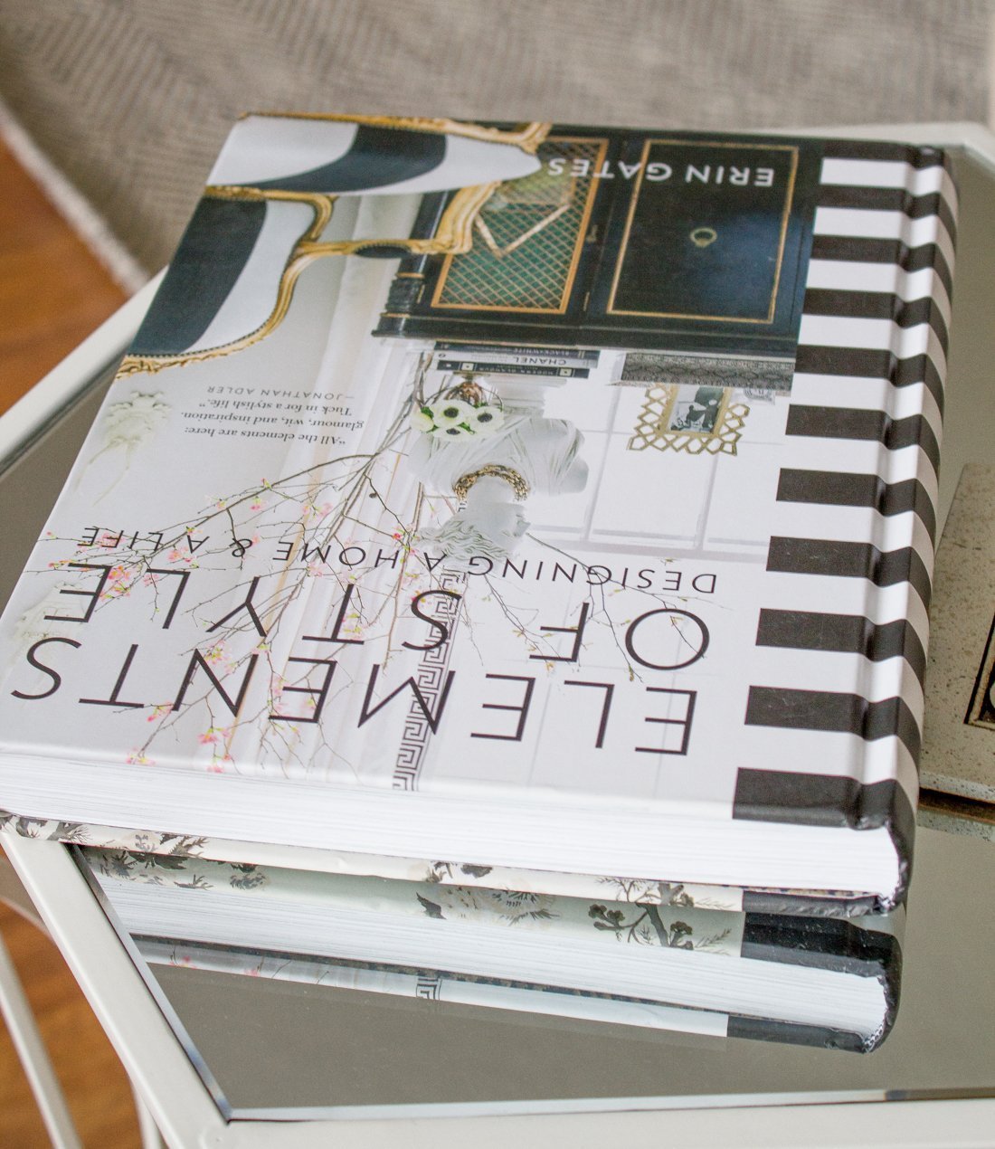
I recently ordered Elements of Style: Designing a Home & a Life by Erin Gates. Hands down the best purchase I’ve made for my house. I found a great deal on a gently used hardcover on Amazon and my nose has been stuck in it ever since. Hopefully my house will look all designer-like in no time. (Cue finger pointing and hysterical laughter.)
As luck would have it, Lowe’s has $0.99 paint samples through this weekend (through the 19th to be exact!). You better believe that I went out and bought almost every single paint sample in stock. I have zero shame. Even better, Lowe’s has most of the Benjamin Moore paint colors saved in their system so it saved me a trip to the nearest store (14 miles, to be exact).

As ridiculous as this looks, I actually felt RELIEF at there being less of that gross orange tan on the walls. Before you think I’m exaggerating, the lighting in these pictures doesn’t make it glow orange. It’s an effect that can be seen in the shadows and the changing light throughout the day and it leaves me cringing. This color is on every.single.wall of our house. #SerenityNow


Challenge #1: Choosing a paint color that helps brighten up a dark living room.
Challenge #2: Choosing a paint color that weathers the changing light of the day. Every single color I bought samples of looks completely different on the three walls I tested them on. The lighting and our furniture also makes them look completely different than the paint chips. #facepalm
Challenge #3: Choosing a paint color that doesn’t clash with the brown tile around our fireplace. I don’t know when I became brown-phobic (I blame blogosphere’s obsession with gray) but I also want to change the tile surround. Brian will probably hate me when I tell him.

I got samples of Benjamin Moore colors Edgecomb Gray, Winds Breath, Athena, Bilboa Mist, Ballet White, Elephant Tusk, Soft Chamois and the blogosphere favorite Revere Pewter. Of these, the biggest disappointment, sadly, was Revere Pewter. It was super dark grey, at least in this living room. We have two east-facing windows but it’s not enough light for many colors to shine.
If you’ve ever set out on a quest for the perfect neutral paint color you’ll probably empathize with how frustrating (and seemingly fruitless) this process may feel. Being the masochist that I am, I purchased even more paint samples than pictured above. My walls are starting to resemble a patched quilt.
Depending on the light in the room, my top two favorites in this line up are Winds Breath and Edgecomb Gray. Winds Breath is a little more of the perfect neutral I’ve been looking for in the morning light. However, as the day goes on it looks white…definitely not the look I’m going for. Edgecomb Gray doesn’t look gray at all in the room (which is good since I have warm tones throughout the adjoining kitchen) but it has a pinkish undertone that’s more pronounced at night. I won’t make my final decision until I paint 3×3 squares on the walls (because I suffer from ‘analysis paralysis’ according to Houzz).

In case you were wondering, these are the colors I’ve sampled. I think I’m going with Edgecomb Gray, and I’m still pretty bummed at how dark Revere Pewter looks in my house.
Which one would you pick?
P.S. If anyone has a better solution to the brown (cringe) napkins to protect the arm rests on our lovely buff-colored sofas I would love you forever!
UPDATE: See which color we chose by clicking HERE.


Jackie @ Our Nashville Life says
My living room is Edgecomb Gray. It was originally my office color, but my husband liked it so I did it in the living room and hallways too. I think it’s a pretty classic color and I love how it changes throughout the day. In the daytime it has more of the tan look, but at night it’s more of a grey. I was not a fan of Revere Pewter as well, but I’m wondering if that could be because of Lowe’s color matching (which I also used)? For almost all of the darker gray samples I got, I found them to look muddy or have too much of an olive undertone. But when looking at color swatches online, no one using BM paint seems to have those issues.
Lisette says
Jackie, I initially thought it was because of the Lowe’s color sample. But I can tell you it’s not. Several months ago I went to Benjamin Moore and bought color samples of Revere Pewter and Thunder Grey. The Benjamin Moore sample and my Lowe’s sample match 100%. So I’m assuming it totally depends on the lighting that these paint colors are viewed in. I fell in love with Revere Pewter in other bloggers’ pictures but sadly it will not work in our house. I will say though that I am pretty impressed with Lowe’s color matching system
Tiara W. says
We ended up going with BM Moonshine and absolutely love it. I so wanted to love Revere Pewter, but it was darker than I wanted
Lisette says
I haven’t heard of that one. I kept telling everyone I was going to paint Revere Pewter. And then I got the sample from BM. Going to look up Moonshine!
Krystal // The Krystal Diaries says
Brown-phobic that made me laugh. My downstairs living area is all brown tones. I love it but looking at Pinterest makes me think I’m behind the times on home decor. Oh well.
autumn says
If you’re going for brightness, I would go with soft chamois.
Lisette says
Thanks Autumn! I already started painting in here, but I’ll consider it for other rooms!
Donna Gordy says
What color trim looks good with the Winds breath. I am considering painting the kitchen walls Wind’s breath and maybe the trim and cabinets a shade of white. What do you think would look good? I’m have trouble deciding. I wanted to paint the walls revere Pewter with white cabinets. Can’t seem to make it all work. HELP!!!!
Katey says
How did it end up turning out? I’m in the same predicament you were in. I’m debating between edgecomb and revere pewter. Revere seems to pull too much blue in my house
Lisette says
I actually posted a new post Our Black and White Living Room as a follow up: https://www.lalalisette.com/our-black-white-living-room/
We ended up choosing Winds Breath because Edgecomb Gray looked a little pink. Our living room is on the east side of our house, if that helps with figuring out our lighting.
Where are you in the process?
Pam says
The orange color of the walls affects the color of all your samples. The colors will not be perceived accurately.. It would have been better if you primed or painted your walls white first. Or painted your samples on white boards.
Lisette says
Thanks for the advice, Pam, but the orange color didn’t really affect the colors as much as one would think. I narrowed them down to two, and then painted large 3×3 squares and made my final decision.
The one time I DID paint on white poster board, the color ended up looking MUCH darker on the wall so now paint samples on the wall are the only way I will go.
window coverings hollywood says
orange color my favorite color. They look awesome! I’ve been having a hard time finding curtains for my house too and I wish I could just have yours, I think they would be perfect. Beautiful room!
Heather Deruelle says
Gorgeous room! I am really struggling with a north room with east window that is dark, 2 small windows and light seems to cast a bit blue so worried about choosing a grey but the creamy milky beigy colours can pull a lot of yellow. I currently have 50% strength revere pewter, it’s too dark and taking on a blue undertone.
I am looking at most of the colours you have and wondering about winds breath and the undertone. I am also curious about soft chamois, ballet white. Is your darker room facing north also?
Thanks so much, I have been looking at colours for months and would like to get samples and do this when I am on vacation, time to get this done!
Sincerely,
Heather